
Key Highlights
• Built the verbal and visual identity for a start-up brand.
• Created brand content, including a website and promotional materials.
• Launched marketing and e-commerce strategies for long-term growth.
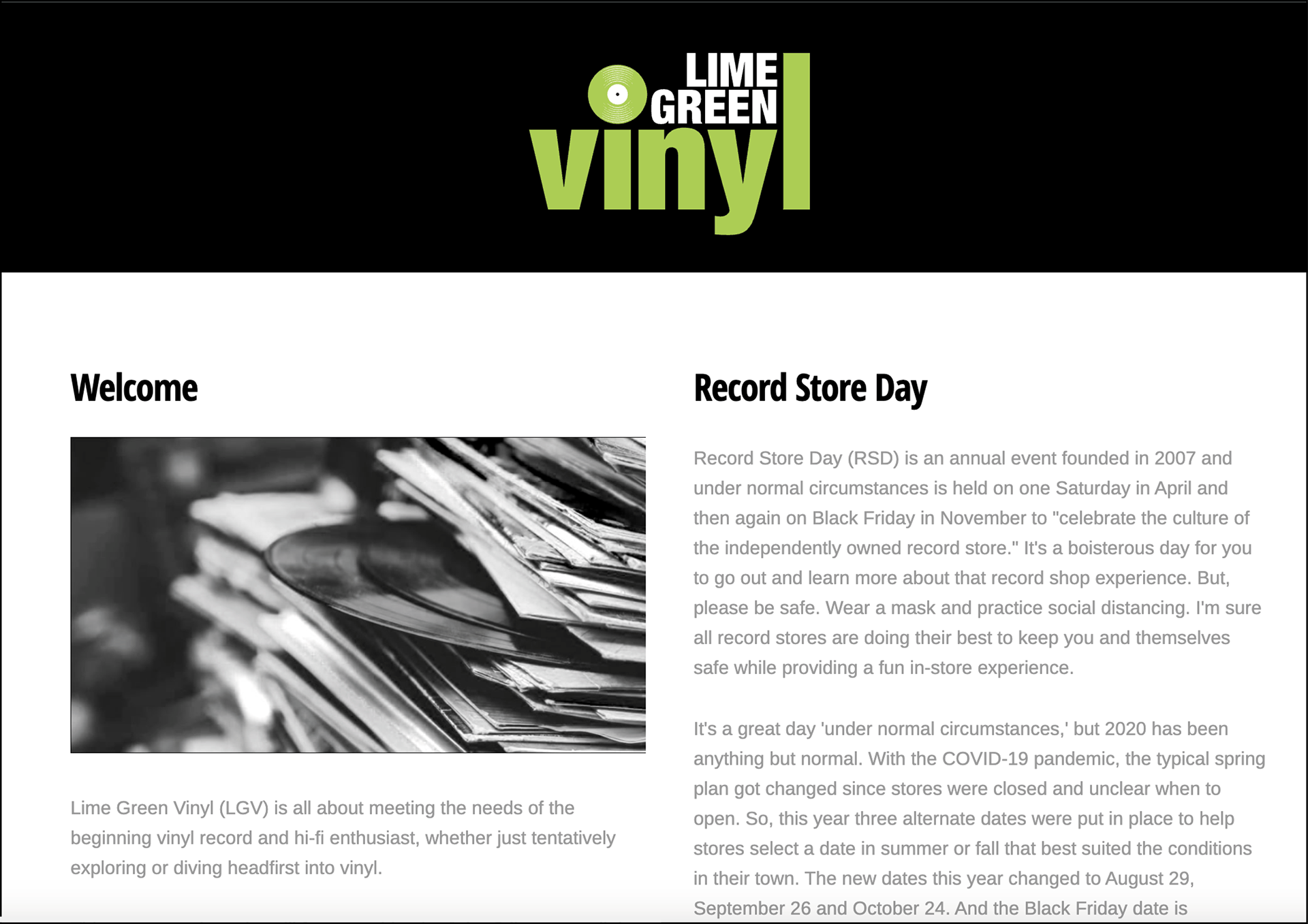
Brand identity
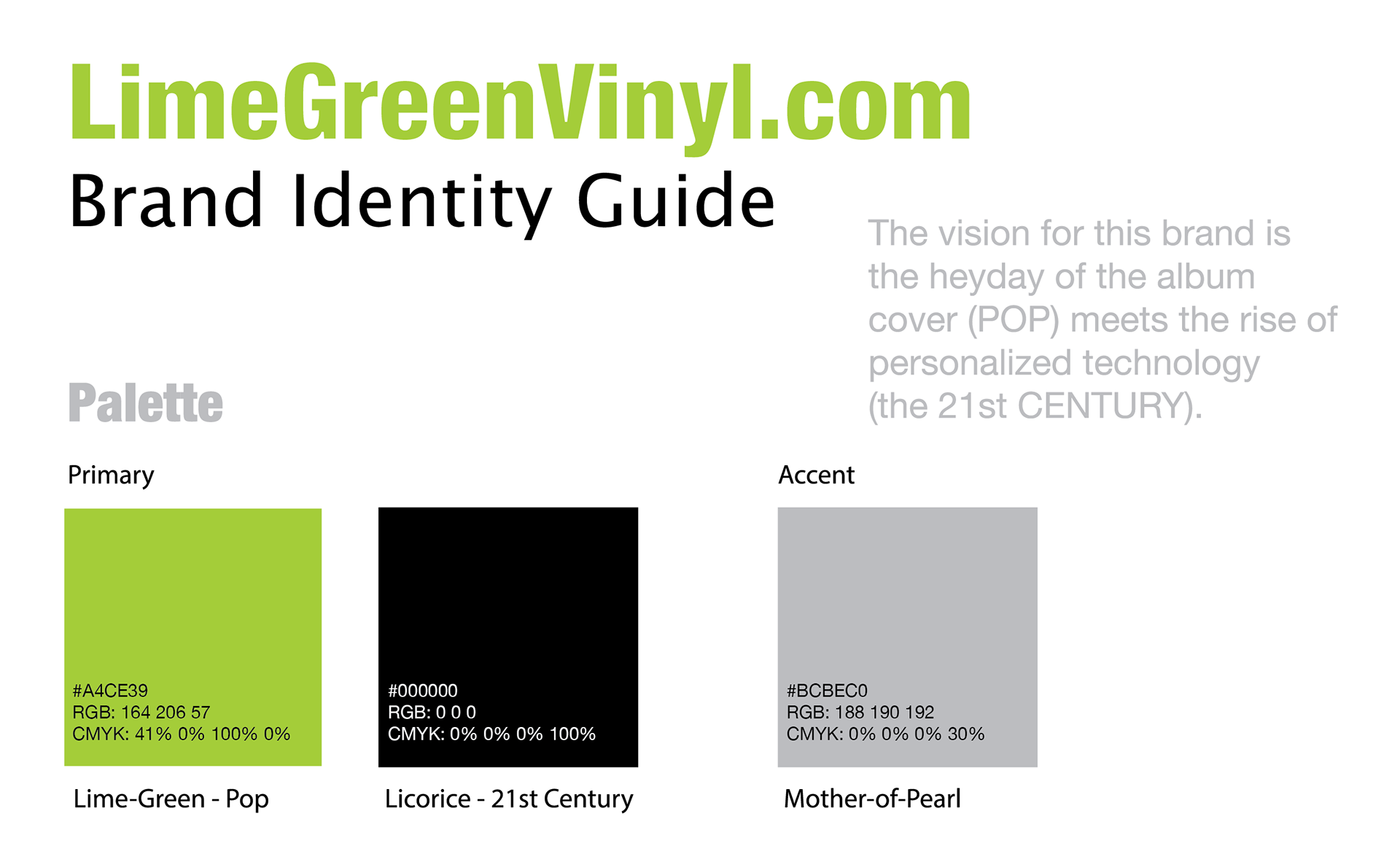
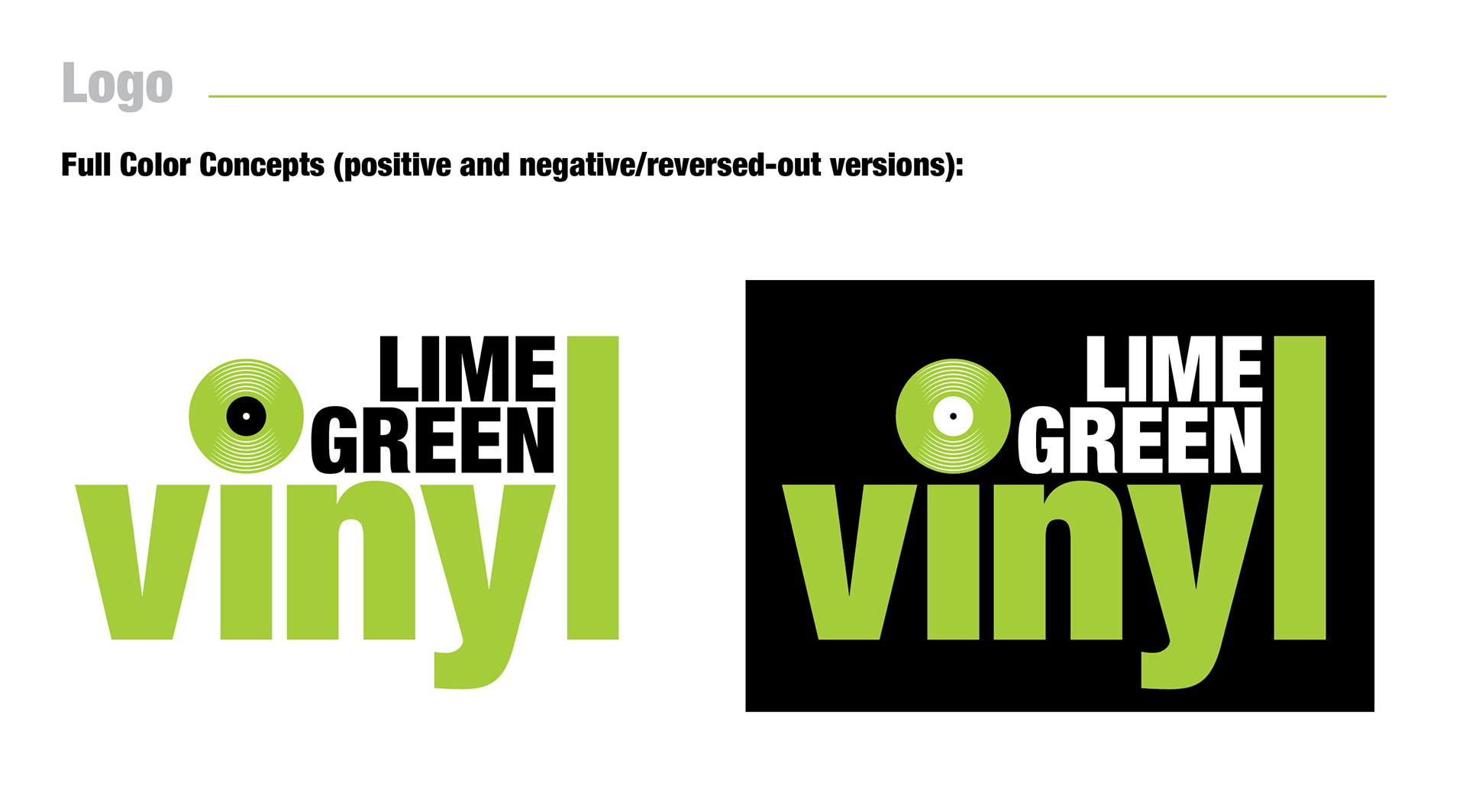
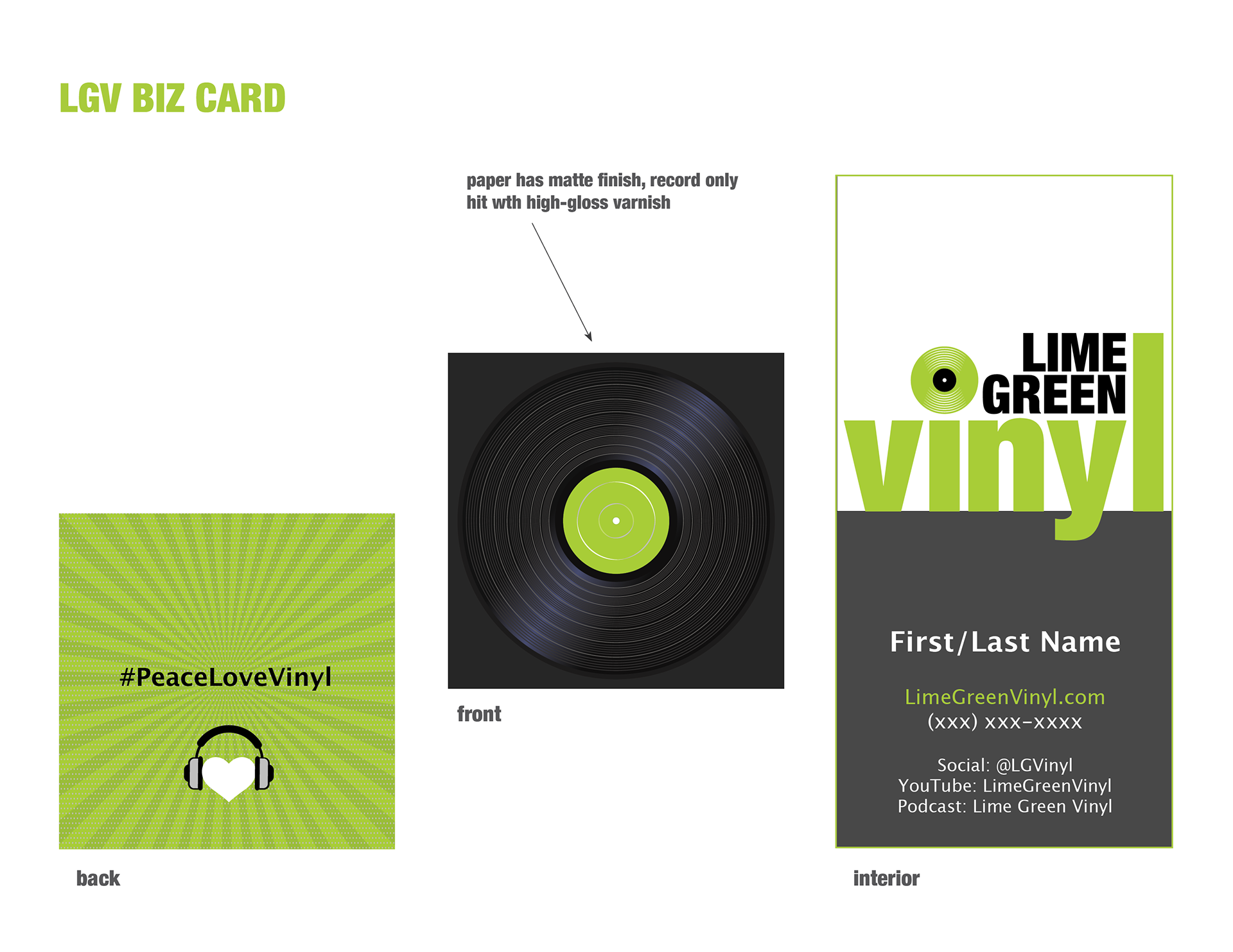
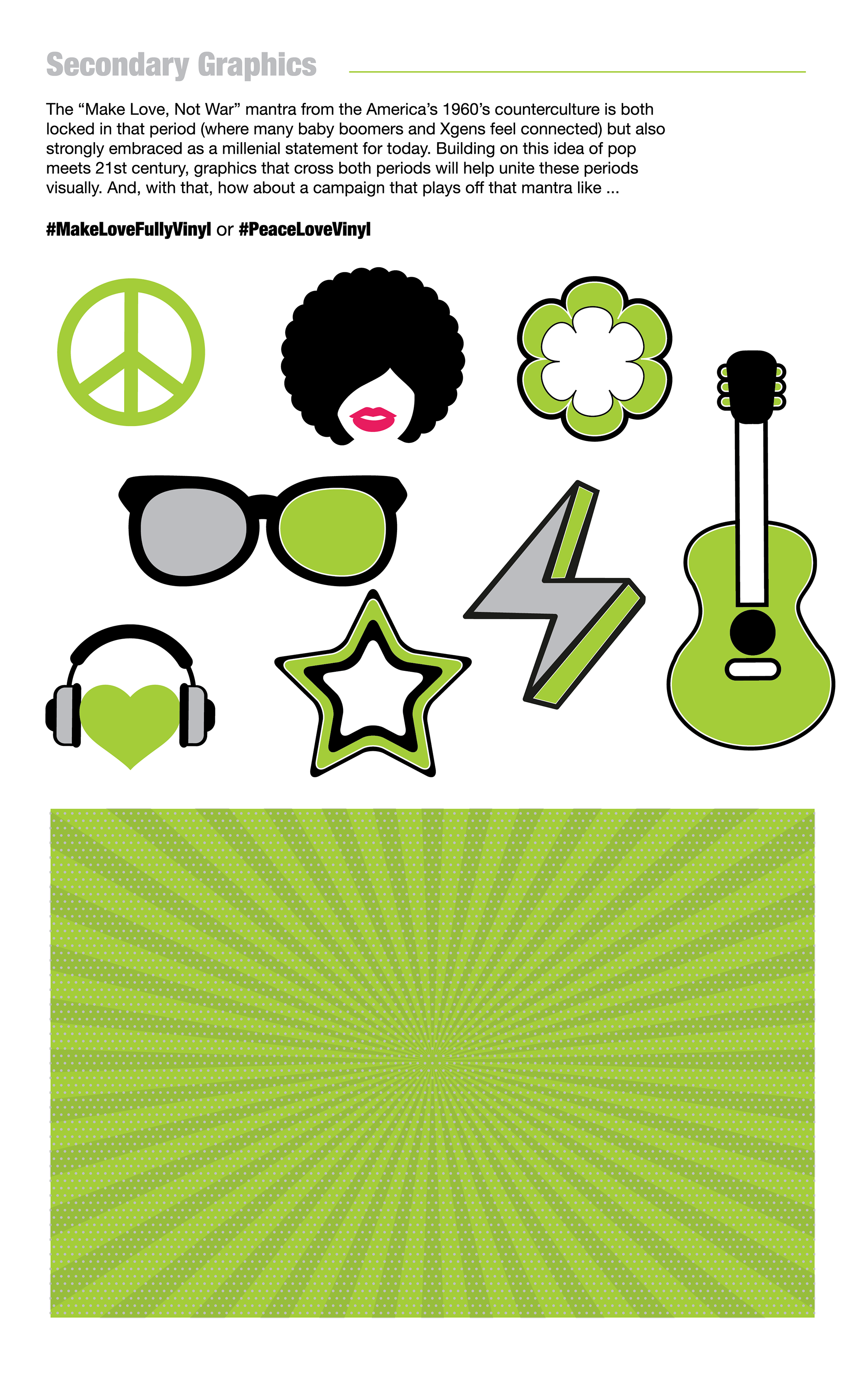
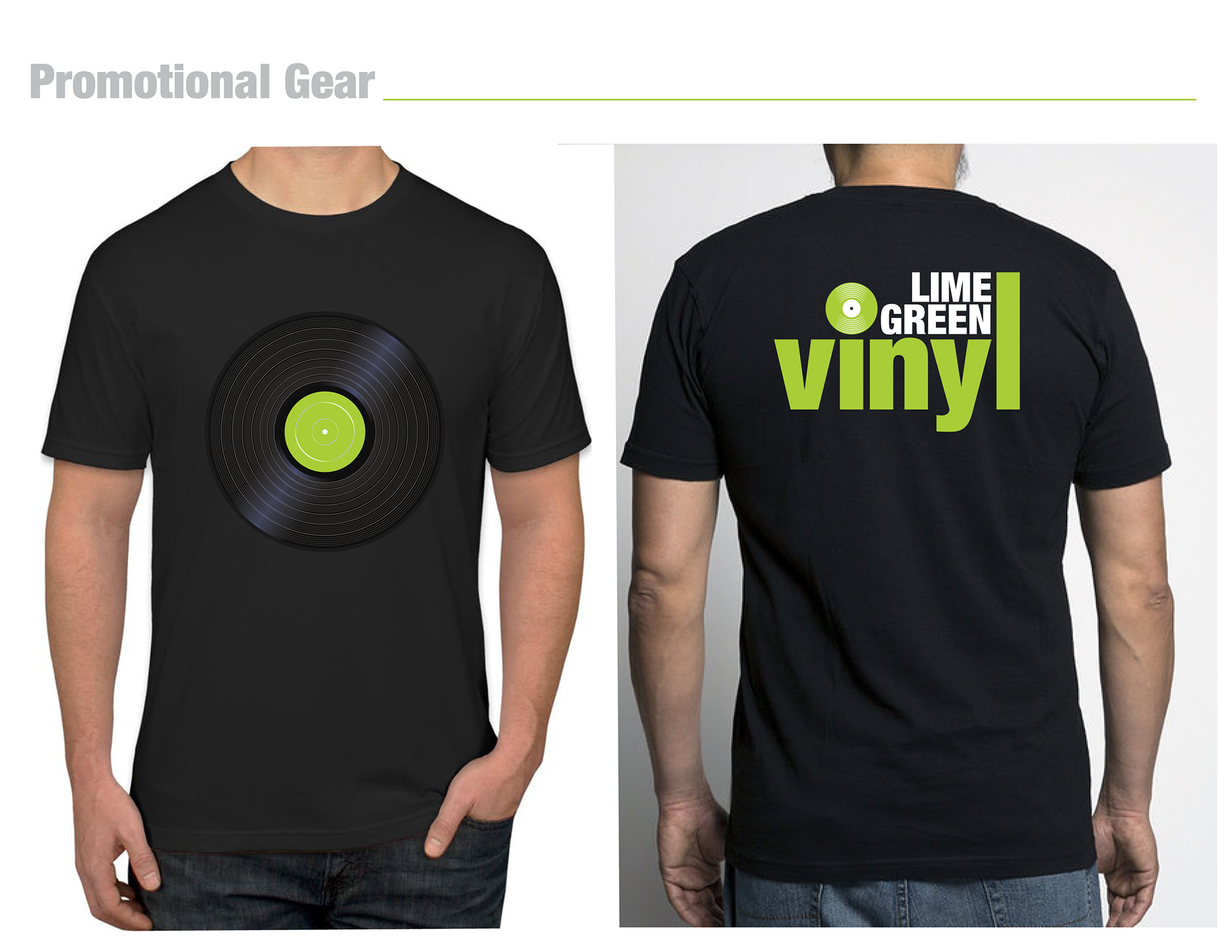
The brand's visual identity is simple, clean, and fresh. The palette is striking and bold, featuring lime-green, licorice, and mother-of-pearl gray. The chunky, bold headline typeface evokes a nostalgic pop feel, while the contrasting body copy is light, modern, and easy on the eye. Graphics are uniform and consistent, enhancing stylistic minimalism. The brand's graphic identity captures the pop vibe of vinyl's heyday, delivered in a modern 21st-century style.


Website Design
The website follows a minimalist design with listable content. It is bright, clean, easy to navigate, and mobile-friendly. The homepage introduces simple steps for starting a vinyl or hi-fi hobby and features a blog and social media pages (Instagram, YouTube, Facebook, Twitter). Menus are simple, and the headlines and copy are minimal and SEO-optimized for easy searching and visual extraction.
The client has not yet activated next phase development on the site. So, what is live is phase 1, basically establishing an introduction, a contact page with some news, and ongoing development of SEO.