
Key Highlights
• Built brand identity, website, and blog for sports journalist Ray Glier.
• Compiled an online portfolio of his published work, highlighting his writing career.
• Established a digital presence to support his freelance writing pursuits.
Website design and development
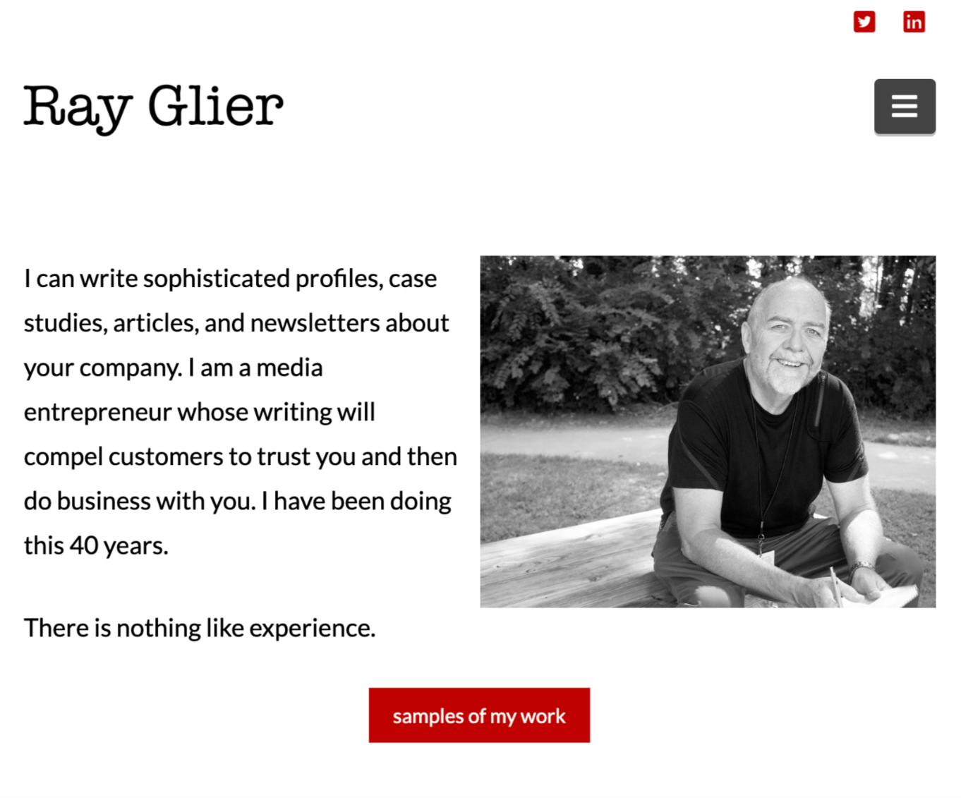
Ray's website is no longer live due to his personal reasons. A screenshot of the home page is above. I have compiled images of my working notes and composites, which were approved by him for the pages before they went live. I thoroughly enjoyed following Ray's blog posts, which he frequently updated on schedule. The posts garnered great engagement, with Ray delving into sports stories with his usual flair. Click on the button below for the PDF showing the site design.

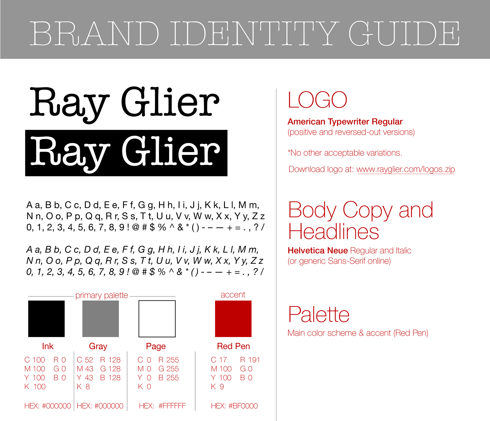
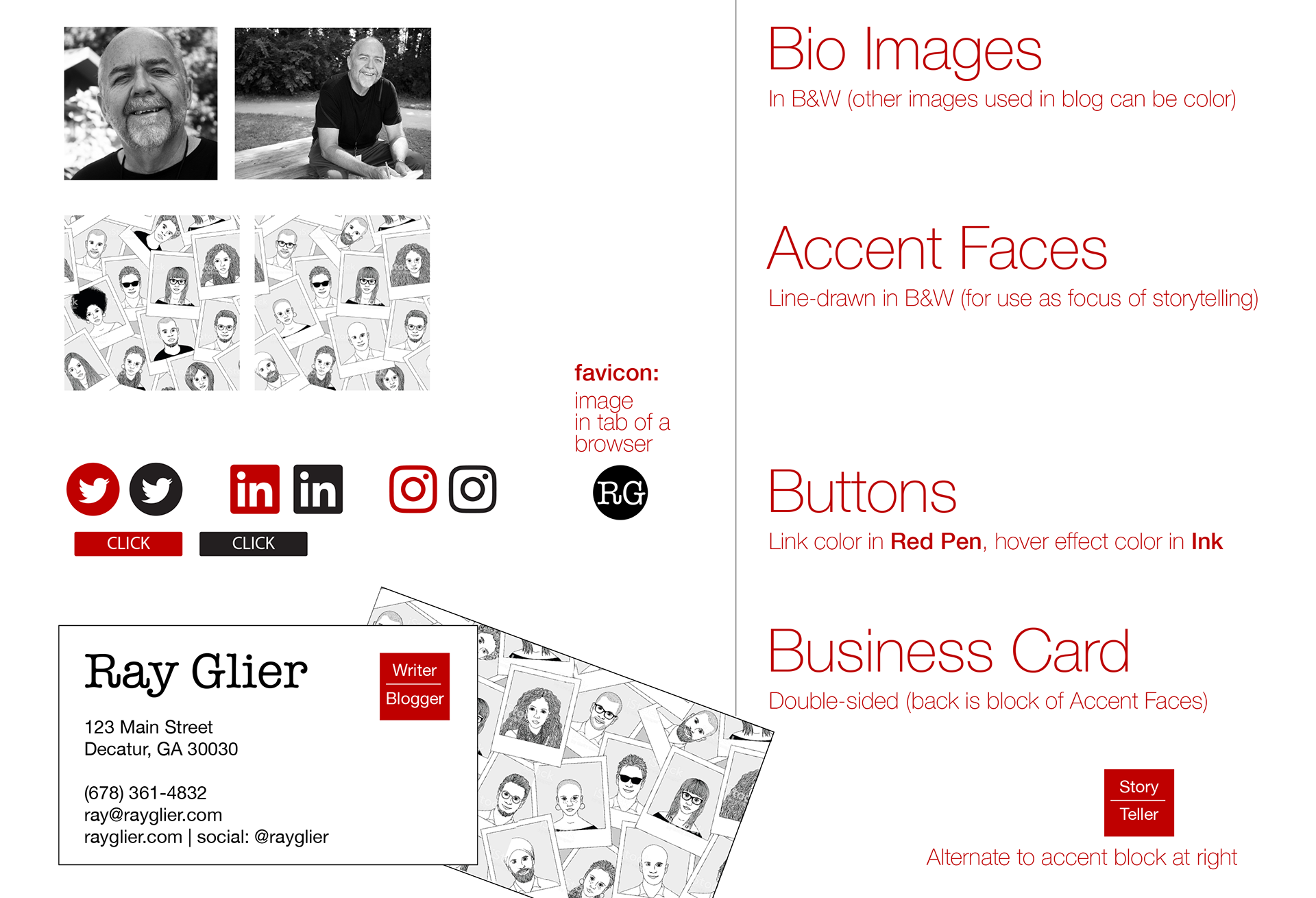
Brand Identity
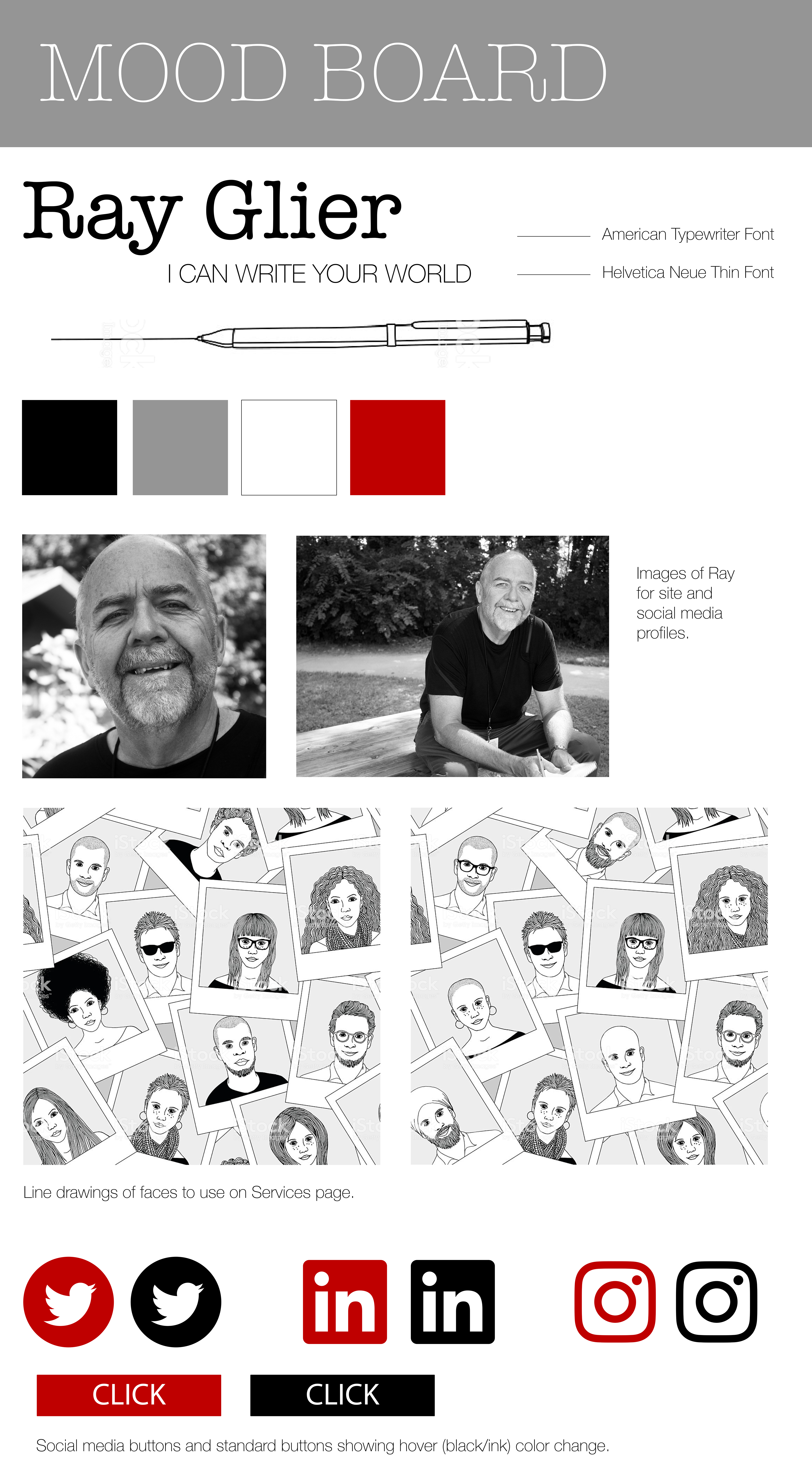
The creative direction for Ray's new brand focused on clean minimalism to showcase his content. The palette consisted of black and white with a strong red accent. Photos were used in the blog and social media, and line image illustrations of faces served as secondary graphics to warm the palette and draw focus to the reader-centric message. The typography was sans-serif, clean, modern, with a modest use of an American Typewriter font for a visual accent, providing a touchstone to his writing and a feeling of connectivity for the reader.

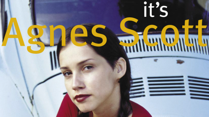
Photography
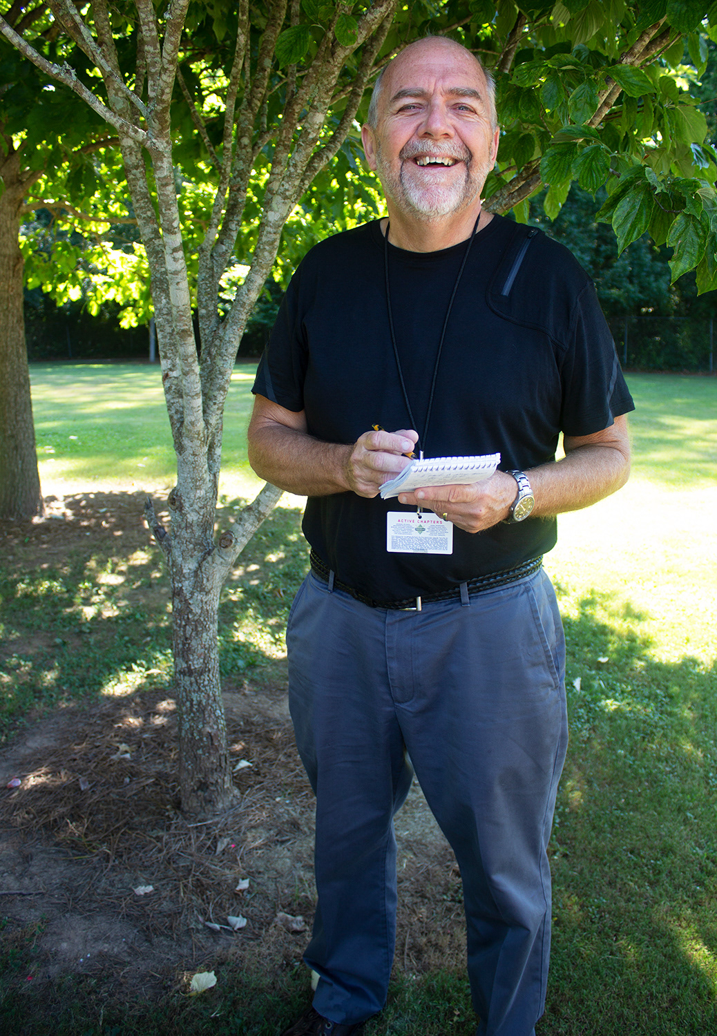
Here are the original images I shot of Ray in color. I converted them to B&W to maintain visual continuity with the brand elements.


Mood board
Here is the original mood board I used when planning Ray's brand design. It gave us a lot to discuss and refine before finalizing his project.